.svg)


Managing multiple client ad campaigns across multiple channels? Overwhelmed by all the data in all your browser tabs? Comparing cross-platform performance and extracting insights from siloed data is incredibly time-consuming.
If connecting the different ad platforms and figuring them out is creating bottlenecks and errors, then what you need is a data visualization dashboard.
Data visualization dashboards serve as a single source of truth for marketing agencies, digital marketers, and their clients through data-driven storytelling and visualization.
They are so critical in today’s multichannel marketing landscape that 86% of businesses believe visualization has become a crucial part of their marketing strategy.
However, only 36% of marketers have used data visualization dashboard platforms (like Tableau) to present key insights and trends to make decisions on behalf of clients. But even with an automation tool, many are still confused about how to present their data in the simplest and clearest way.
In this post, we show you different types of visualizations that you can use to extract and report actionable, accurate insights for clients on a data visualization dashboard, including…
Plus, examples and templates of how to use each visualization tool on a marketing dashboard.

A data visualization dashboard presents KPIs, advertising metrics benchmarks, and ad creative data analytics through charts, graphs, maps, widgets, and images. It provides advertisers with the dashboard tools needed to understand trends, outliers, insights, and patterns in their overall marketing efforts at a glance.
Like business intelligence dashboards, data visualization tools aggregate and categorize all advertising insights for each of your clients and present findings in a digestible, easy-to-follow way.
These interactive dashboards provide bird’s-eye-view access to information necessary for all spheres, saving you time and energy by taking care of everything – from aggregating data to building reports.
But what are the most commonly used data visualization tools, and how can marketers implement them in their advertising strategy?
We’ve rounded up ten data visualization examples you can implement on your business dashboard to dissect complex marketing data and present them to your clients in a way that they can immediately tell how well their ad dollars are spent.

Bar charts use horizontal or vertical rectangular bars to represent data along an x and y-axis visually. They’re great for determining how different metrics, KPIs, and trends compare against each other, as well as mapping how specific datasets have changed over time.
With bar charts, you no longer need to pull different tricks to fit lengthy labels or multiple categories. This visualization tool is easy to understand and widely-used by marketers, giving you and your clients an edge over other graphs that are difficult to read or only show a single data point.

Funnel charts remain one of the most insightful data visualization tools for highlighting bottlenecks in a process. Typically displayed as an inverted pyramid, funnel charts illustrate stages within a process that are linear and connected.
In the digital marketing process, funnel charts visualize how potential customers become qualified leads, narrowing it to those who request a quote, and finally to customers. They are also great for data analysis into clients’ conversion rates, showing the percentage of website visitors that click through to view products.

Also known as the cause-and-effect diagram, a scatter plot maps out the values of two or more datasets as points. You can use this tool to help determine the correlation between two unrelated variables (e.g. ad spend vs. conversion rates) for each ad channel, as well as visualize the relationship between your client’s product and the behavior of their customers.

Visualization dashboards are more than just charts and graphs.
Clear communication is vital in data-driven decision-making and for the overall success of marketing campaigns. But more often than not, the task of sifting through different metrics at once can quickly become overwhelming, especially across multiple clients.
Notepad widgets let you organize all your thoughts by means of visual elements such as text, images, or videos along with the KPIs on your dashboard, which streamlines communication with ease.

Single metric widgets allow you to customize your KPI dashboard with a series of individual micro charts that help track down your most important KPIs in real-time.
With single widgets, you’ll be able to:

Using creative widgets on your data visualization dashboard can help you to create the most granular cross-platform reports.
Similar to single metric widgets, you can easily drag-and-drop creatives, customize the selection of KPIs displayed on creative cards, and obtain in-depth insights for the best and worst-performing ad creatives across your client’s digital marketing channels.

When using an interactive dashboard, being able to view all campaign performance metrics, KPIs, ad campaign alerts, data sources, and visualization widgets in a single place can help streamline the efficiency of your team’s overall workflow and decision-making processes for clients.
Having draggable widgets on your data visualization dashboard interface lets you drag-and-drop specific marketing metrics, KPIs, tables, and infographics directly from the side panel onto your workspace for easier access.

Important metrics on your dashboard are completely resizable and adjustable, allowing you to see each of your client’s most relevant information on full display. Once customized with metrics of choice, widgets can be expanded or collapsed to put the most important data first.
Resizable features let you adjust the height or width of a certain widget within the constraints of your workspace, allowing you to fine-tune how much information or types of data you want to see on each widget.

The goal of data visualization is to help viewers quickly digest information and remember it. As such, utilizing specific color clusters across your dashboard strategically helps your clients understand the story behind the data presented – and remember the most important details.
While there’s no one right way to use color, interactive visualizations like color clustering tools let you see which colors within your ad creatives are driving the best performance for your chosen KPIs.

Ever found yourself staring blankly at a lengthy data dashboard design or endless pages of text? With so many insights to comprehend at once, it can become overwhelming real fast.
From ad networks to mobile measurement partners (MMPs), word clouds map out keywords driving the highest performance across different channels for your chosen KPIs. If you’re an agency with big clients, word clouds are a handy tool to identify search terms used by competition to bump up your own on-page SEO rankings.
Now that you’re aware of the best data visualization tools, let’s move on to how you can use them to structure your marketing dashboards.
Below are five dashboard examples of how you can use the data visualization tools for high-impact reporting.
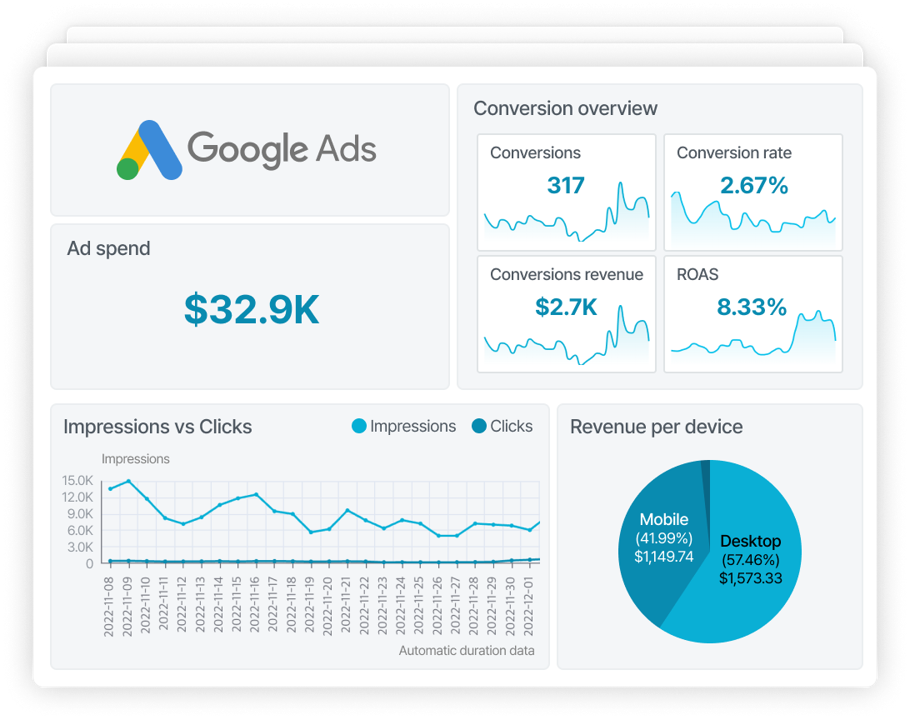
If you’re a marketing agency or a brand with multichannel campaigns, a PPC dashboard can save you hundreds of hours on tedious, manual tasks.
With an automated tool, you’ll be able to see the key insights from all your clients’ ad campaigns and take advantage of opportunities in a snap.


Clicks overview
Cost overview
Conversions overview

An eCommerce dashboard template highlights key KPIs, trends, and relationships related to the performance of your eCommerce website and ad campaigns.
If you have ad campaigns for your online store, a ready-made web template will show you exactly how much revenue is generated from each ad channel, how much you spent on it, and what the conversions and return on investments on your ads are.


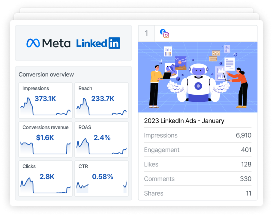
A social media dashboard aggregates and visualizes key metrics from all your paid social ad campaigns. You’ll be able to see individual social media metrics, compare one metric against another, and analyze trends and relationships.
When the time comes for ad reporting, a dashboard can generate a summary of all your social media marketing efforts within minutes. Some dashboards, like Adriel, also show you ad creative data so you can A/B test on a single platform.


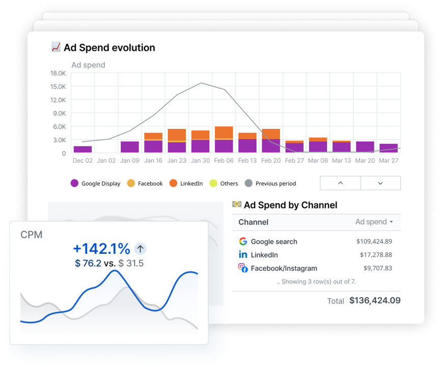
As your marketing agency grows, it becomes simply unsustainable to manage ad campaigns and client reports via Excel spreadsheets.
A client report dashboard can save you countless hours on data analysis and reporting while providing your clients the precise metrics and numbers that they need to know, such as ROAS and conversion rates.


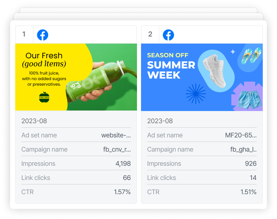
Ad creatives are crucial for campaign success, yet most digital marketing dashboards only show performance metrics at a high-level.
To truly optimize your ad campaigns, you need more granular ad creative reports that pinpoint which creatives are effective and why.


In this article, we explored the importance of data visualization strategies for marketing agencies, as well as ten examples of visualization tools you can implement in your ad campaigns to extract actionable, data-driven insights.
If you’re looking for an all-in-one platform for all your data to see the big picture and make well-informed decisions, Adriel is your ideal solution.
Get started immediately with Adriel's cross-channel dashboard template for data visualization on campaign data in one centralized location, access data across your ad channels, and identify underperforming and overperforming campaigns for your clients in real-time.
Adriel goes the extra mile and lets you see granular data, right down to the ad creative level. A/B test your creatives on one platform, compare performance, and make better business decisions.
Book a 1-on-1 demo call with our product specialist today.